

I have been looking at business websites for nearly three decades. If there is one pattern I see repeatedly, it is this: businesses do not lose customers because their service is weak. They lose them because their website creates silent friction.
Not dramatic technical failures. Not obvious crashes. Just slow loading, unclear structure, cluttered layouts or poor mobile usability. Those small moments of hesitation cost real money.
India is a mobile-first country. More than seventy percent of internet traffic happens on smartphones. Google knows this, which is why it evaluates websites using mobile-first indexing. That means your mobile version is your primary version. If it struggles, your rankings struggle.
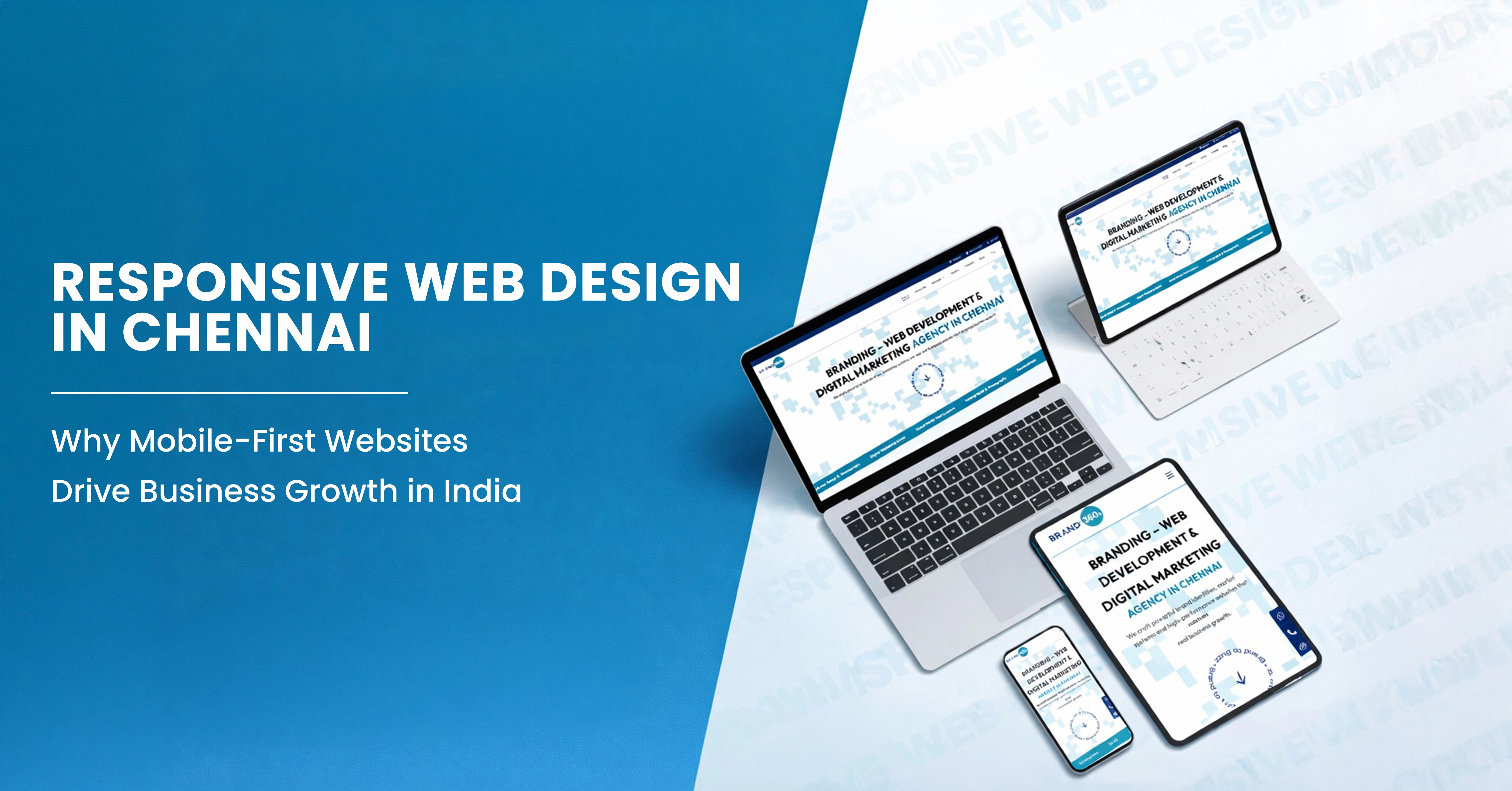
In my experience, responsive web design is no longer a design decision. It is business infrastructure. For companies in Chennai and across India, it determines visibility, credibility and ultimately growth.
📱 India's Mobile Reality
India is a mobile-first country. More than seventy percent of internet traffic happens on smartphones. Google evaluates websites using mobile-first indexing — meaning your mobile version is your primary version.
in India
indexing priority
What Responsive Web Design Really Means Today
Over the years, I have noticed that many businesses misunderstand what responsive design actually means. They assume that if a website fits on a phone screen, it is responsive. That is not enough.
True responsive web design ensures that layout, typography, navigation and content structure adapt intelligently across devices. Modern standards go further. A mobile-first approach begins by designing for the smallest screen first and then scaling upward. That decision changes how information is prioritized and how calls to action are placed.
When I work with clients through professional responsive website design services, I always begin with mobile behavior. I ask one simple question: what does the user need to see within the first five seconds on a phone? If that answer is unclear, the structure is wrong.
Mobile users do not browse casually. They scan. They decide quickly. If your value proposition is buried below clutter or your enquiry button is hidden, they move on.
Why Mobile-First Design Matters for Businesses in Chennai
Chennai is not a passive digital market anymore. It is competitive and fast-moving. I have seen real estate developers, consultants and healthcare providers lose qualified leads simply because their mobile experience felt confusing.
Even in B2B sectors, discovery often starts on a smartphone. Buyers research on the move. They shortlist quickly. If your website feels slow or difficult to navigate, credibility drops immediately.
In my audits, I often see high mobile bounce rates paired with strong desktop performance. That tells me one thing: the structure was designed desktop-first. Today, that approach is outdated.
How Mobile-First Design Impacts Conversions
Over decades of reviewing conversion data, one principle remains constant. Clarity converts.
When businesses study what truly represents the best website layout for conversions, they discover that mobile layout order often influences enquiry rates more than design aesthetics.
Mobile-first websites convert better because they remove friction. They present the core message early. They position enquiry triggers naturally. They reduce cognitive overload. They simplify forms.
A design that looks elegant on a large screen but collapses awkwardly on mobile does not just reduce usability. It reduces trust. Trust drives conversion.
SEO and Performance Benefits of Responsive Web Design
From an SEO perspective, I have watched the evolution closely. Mobile usability is no longer optional. It is a ranking factor.
Google's mobile-friendly guidelines emphasize readable text, stable layouts and fast loading speeds. Core Web Vitals measure real mobile user experience. Loading performance, layout stability and interaction responsiveness reflect how professional your brand feels.
In Chennai's local search ecosystem, mobile optimization directly influences visibility. Most "near me" searches happen on smartphones. Google Business Profile engagement happens on mobile. Map pack rankings depend on user interaction. If your mobile experience is weak, your local SEO suffers.
I have seen businesses invest heavily in SEO campaigns while ignoring mobile structure. The result is predictable. Traffic increases but conversions do not.
A Real-World Pattern We See Repeatedly
In one recent audit, a mid-sized service firm in Chennai was generating steady traffic but very few enquiries. Their desktop website looked refined but their mobile bounce rate was above 68 percent. Forms were difficult to complete on smaller screens and the primary call to action was buried below heavy imagery.
After restructuring the site using a mobile-first architecture, improving loading speed and repositioning enquiry triggers within the first scroll, their mobile bounce rate dropped by nearly 22 percent within three months. Enquiry conversions increased by over 30 percent without increasing ad spend.
Traffic was never the issue. The structure was.
I see this pattern repeatedly. Businesses focus on design polish or advertising budgets when the real leak sits in mobile usability.
When a Responsive Redesign Becomes Necessary
There are clear warning signs. High mobile bounce rates. Declining enquiry conversions. Mobile usability warnings inside Google Search Console. These are not technical inconveniences. They are business indicators.
Cosmetic fixes rarely solve structural problems. If hierarchy is weak, scroll flow is confusing or performance is slow, a deeper redesign is required.
A structured mobile-first website design guide helps align design with growth. As companies scale, their digital foundation must scale with them. A mobile-first redesign becomes essential.
Closing Perspective
After decades in this field, my conclusion is simple. Responsive web design is not about resizing screens. It is about aligning digital architecture with real human behavior.
In a mobile-first country like India, businesses that grow are those that design for speed, clarity and usability from the beginning. This is why working with professional website designers in Chennai who understand local market behavior and mobile consumption patterns makes a measurable difference. When users feel at ease, search engines reward it. When search engines reward it, growth follows.
Mobile-first design is not a trend. It is the baseline for serious digital presence.
