How BRAND 360s helped AVENIR - an equine-guided coaching brand
move from a powerful idea to a brand people can actually feel, remember and trust.
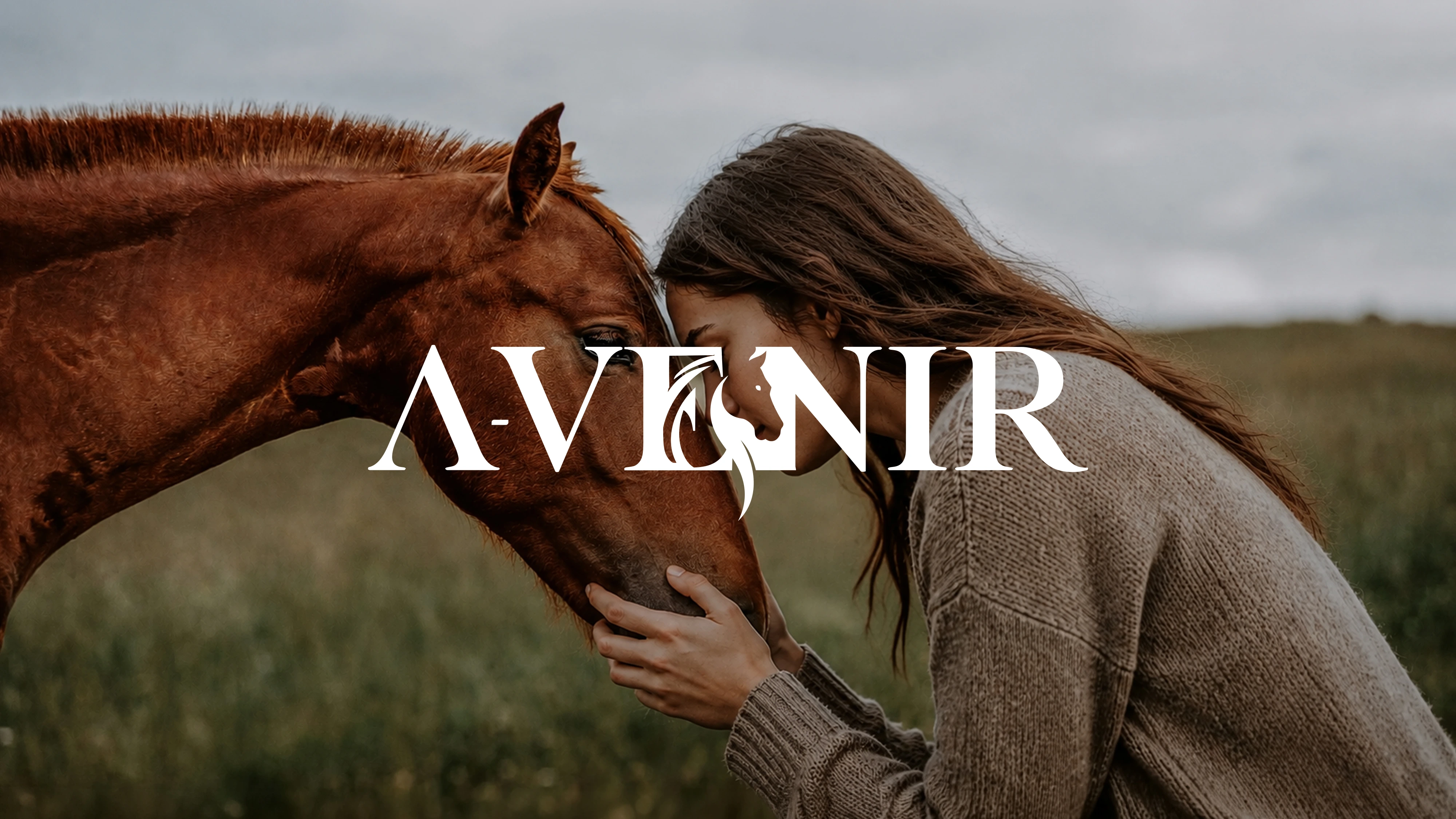
Even the name carries meaning. AVENIR a French word.
Avenir → "The Future"
A brand built around what’s ahead. Around possibility. Around becoming.
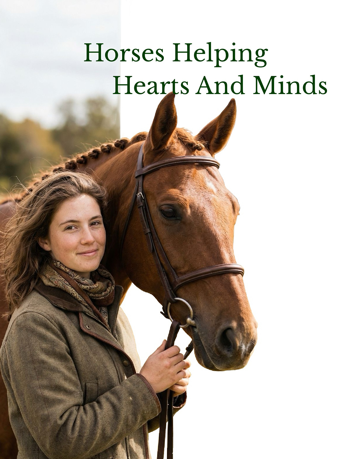
At its core, AVENIR isn’t just a coaching brand. It works with something deeply human helping people reconnect with themselves through the quiet, intuitive presence of horses.
There’s depth in that work. Real depth. But when we first saw the brand, something didn’t match. The experience was powerful. The transformation was real. But the identity? It wasn’t carrying any of it.
"The purpose was powerful.
The brand was invisible."


AVENIR came to us with clarity in what they do, but not in how they show up. They needed a brand that could do something very few brands get right.
Because the space they operate in is crowded. Soft colours. Generic symbols. Predictable visuals. Everything starts to look the same after a point. AVENIR didn't need to shout louder. It needed to mean something deeper. To build this unmissable presence, our studio deployed strategic brand identity design services crafted to establish premium visual authority.

"A brand that looks like everyone else can't be valued differently."
Most coaching and wellness brands are visually interchangeable. A leaf. A gradient. A symbol that looks nice but says nothing. Safe. Forgettable. Disconnected from the transformation they promise.
AVENIR wasn't lacking ambition. It was lacking a visual language strong enough to hold the weight of its work.


The brand existed. But people couldn’t feel it.


We didn't start with design. We started with understanding. Because identity is not created in software. It's uncovered in meaning.
Before a single sketch, we asked: What does healing actually feel like here? What does transformation look like in this space? What does the relationship between human and horse represent? Those answers shaped everything.
Instead of adding more elements, we asked: Can the meaning already exist inside the name itself? No illustrations. No obvious symbols. Just structure.
Typography. Color. Proportion. Every decision had a role — to reinforce emotional depth and premium positioning.
The strongest ideas are the ones you feel before you understand.

The rise and fall of the letterforms reflect natural highs and lows, framing the true internal rhythm of transformation.
A·VEmotional highs and lows. The structural rhythm of transformation.
The E (from horse) and N (from human) meet within the structure - discovered seamlessly as a quiet bridge between two beings.
E·NhorsE + humaN connected inside the structure. Discovered, not explained.

Look closer, and a subtle equine presence emerges organically within the core architecture — not imposed, but discovered.
🐴Subtle equine presence hidden inside. Undeniably there.
Not a horse. Not a human. Not just letters.
A connection - woven into the future.

Once the idea was right, everything else followed with intention. Every visual decision was carefully crafted to communicate trust, clarity, and emotional connection.
Elegant serif letterforms that are sophisticated, trustworthy, and emotionally grounded. The custom connections created a rhythm that feels human while maintaining a premium presence.
Deep Green for healing, grounding, and balance; paired with Beige and Gold for warmth, refinement, and premium presence. A timeless palette designed to build trust.
Minimal geometry engineered to scale beautifully across every touchpoint. Clean without feeling cold and premium without feeling distant.
Establishing clear visual market positioning requires deep strategic alignment. Every brand touchpoint should reinforce credibility, consistency, and trust. When identity systems become fragmented, customer confidence decreases and conversion opportunities are lost. Strong brands create recognition before a single word is read.
Before
After
AVENIR now has more than a logo.
It has a presence that feels as powerful as its purpose.
We don’t deliver logos. We deliver complete brand systems designed for consistency, scalability, and long-term recognition.
Everything needed to show up consistently across every touchpoint — from business cards and presentations to websites and digital marketing campaigns.
Most brands invest in design. Very few invest in how they are perceived.
If your brand looks like everyone else, it will be treated like everyone else. And when that happens:
Let’s build something that commands attention, builds trust instantly, positions you at a premium and converts consistently.


