

Most businesses still think of mobile optimization as a design requirement.
In reality, it is a business requirement.
Customers no longer wait until they reach a desktop computer to research a company. They search while commuting. They compare options during meetings. They browse between appointments. They make decisions from their phones.
Yet many business websites continue delivering a desktop-first experience in a mobile-first world. The consequences are often invisible. Traffic arrives. Visitors browse briefly. Potential customers leave. The business assumes the problem is marketing. The real issue may be the experience itself.
At BRAND 360s, we frequently review websites that look professional on desktop but create friction on mobile devices. As a website design services in Chennai team, we see this pattern repeatedly — the website technically works, but it does not work well enough to create confidence, engagement or enquiries.
A mobile-friendly website is no longer a competitive advantage. It is the minimum expectation. The businesses growing consistently online understand this reality. They do not optimize for screens. They optimize for people.
Mobile Has Changed How Customers Discover Businesses
Customer Behaviour Has Shifted Permanently
The way people interact with businesses has changed dramatically over the last decade. For many industries, mobile devices have become the primary way customers discover products and services. The customer journey now starts in a pocket rather than at a desk.
The First Visit Often Happens on a Phone
Before a customer calls. Before they submit an enquiry. Before they compare pricing. They visit the website. In most industries, that first interaction now happens on a mobile device. The first impression of the business is often formed on a six-inch screen.
Businesses Must Adapt to Reality
Customer behaviour determines website requirements. Not design trends. Not personal preferences. Not what worked five years ago. The businesses that adapt to changing customer behaviour usually outperform those that do not.
The First Impression Happens on Mobile Before It Happens Anywhere Else
Visitors Judge Faster Than Most Businesses Realize
People form opinions quickly. Far more quickly than most companies expect. Website performance, readability and usability all influence those opinions.
Mobile Friction Creates Immediate Doubt
A confusing menu. Tiny text. Buttons that are difficult to click. Slow loading pages. Each creates hesitation. Hesitation reduces trust.
Trust Begins Before Visitors Read Your Content
Many businesses spend enormous effort refining their messaging. Yet visitors may leave before reading any of it. Why? Because the experience itself created doubt. A mobile experience is often the first trust signal a customer encounters.
Why Mobile-Friendly Design Is Really About Customer Experience
Customers Judge the Entire Business
Visitors rarely separate the website from the company behind it. If the website feels outdated, the business feels outdated. If the website feels frustrating, the business feels frustrating. If the website feels professional, the business feels professional.
User Experience Influences Business Perception
A mobile-friendly website does not simply improve usability. It influences credibility. That distinction is important. Businesses are not competing only on products or services. They are competing on experience.
Better Experiences Build Confidence
Confidence is often the missing ingredient behind conversions. Visitors enquire when they feel comfortable. Mobile-friendly experiences help create that comfort.
The Hidden Cost of Poor Mobile Experiences
Most Businesses Never See Lost Opportunities
A lost lead rarely announces itself. The visitor simply leaves. No notification appears. No warning is issued. The opportunity disappears.
Mobile Problems Are Often Invisible
Business owners frequently review their websites on desktop computers. Customers experience them on phones. That difference creates blind spots.
Small Frictions Create Large Business Consequences
A difficult enquiry form. A slow page. Poor navigation. Each seems minor. Together they influence trust, engagement and conversion.
Why Mobile-Friendly Websites Generate More Leads
Simplicity Encourages Action
Visitors are more likely to take action when the process feels effortless. Mobile-friendly websites reduce unnecessary obstacles.
Confidence Supports Conversion
People contact businesses they trust. Trust grows when experiences feel smooth and professional.
Better Experiences Produce Better Outcomes
The businesses generating consistent enquiries online are rarely relying on luck. They create environments that make engagement easy. If your website is creating friction rather than conversions, working with a website development company in Chennai that understands mobile-first performance can make a meaningful difference.
What Google Thinks About Mobile Experience
Google Prioritizes User Experience
Google's goal is not merely to rank websites. Its goal is to satisfy users. Websites that create better experiences often receive greater visibility.
Mobile Performance Influences Search Visibility
Mobile usability has become an important part of how search engines evaluate websites. A poor mobile experience can limit performance.
Related: Understanding how website speed affects SEO rankings helps explain why mobile performance cannot be ignored.
A Poor Mobile Experience Makes Every Marketing Campaign More Expensive
Marketing Can Bring Visitors But It Cannot Create Patience
Businesses invest significant amounts in Google Ads, Meta Ads, SEO, LinkedIn Marketing, Email Marketing, and Social Media Campaigns. All of these activities have one objective — bring potential customers to the website. The problem is that marketing stops working the moment visitors arrive on a poor mobile experience. A campaign can generate clicks. It cannot generate patience.
Every Lost Visitor Has Already Cost Money
Many business owners focus on the cost of acquiring traffic. Far fewer think about the cost of losing it. Imagine spending ₹50,000 per month on advertising. Hundreds of people visit the website. A significant percentage leave because pages load slowly, buttons are difficult to use, forms feel frustrating, or content is difficult to read. The marketing budget was spent. The opportunity was lost. This is why mobile experience directly influences marketing ROI.
Deep dive: Read our guide on website conversion optimisation to understand how improving the experience after the click reduces customer acquisition costs.
Founder Insight From BRAND 360s
One of the most common misconceptions we see: that businesses believe marketing and website performance are separate conversations.
They are not. A website does not exist independently from SEO. It does not exist independently from Google Ads. It does not exist independently from social media. Every marketing activity eventually leads people to the website. Which means the website either amplifies marketing results or quietly reduces them.
When leads slow down, businesses usually assume the market has changed, competition has increased, or advertising has stopped working. Sometimes those things are true. More often, the website experience is creating enough friction to reduce conversions.
The businesses generating the strongest results online understand that customer experience is not a design decision. It is a business strategy. And mobile experience is now one of the biggest parts of that strategy.
Chennai Business Examples
🦷 The Dental Clinic
A dental clinic in Chennai invested consistently in Google Ads. The campaigns generated clicks, but most visitors arrived on mobile devices. Treatment pages loaded slowly, navigation felt cluttered, and the enquiry process required unnecessary effort. Potential patients left. The issue was not traffic — it was conversion.
🏠 The Interior Design Studio
A Chennai interior design studio built an impressive Instagram presence. Visitors regularly clicked through, but project galleries loaded slowly and the enquiry form felt overwhelming on mobile. Once the mobile experience improved, enquiries increased — not because traffic increased, but because friction decreased.
💡 The Lesson
In each example, the business focused on acquiring visitors. The real opportunity was improving the experience after visitors arrived. Mobile optimization directly influenced business outcomes.
📱 Mobile-First Thinking
Understanding mobile-first website design principles helps businesses design for how people actually behave on phones — not simply adapt desktop layouts to fit smaller screens.
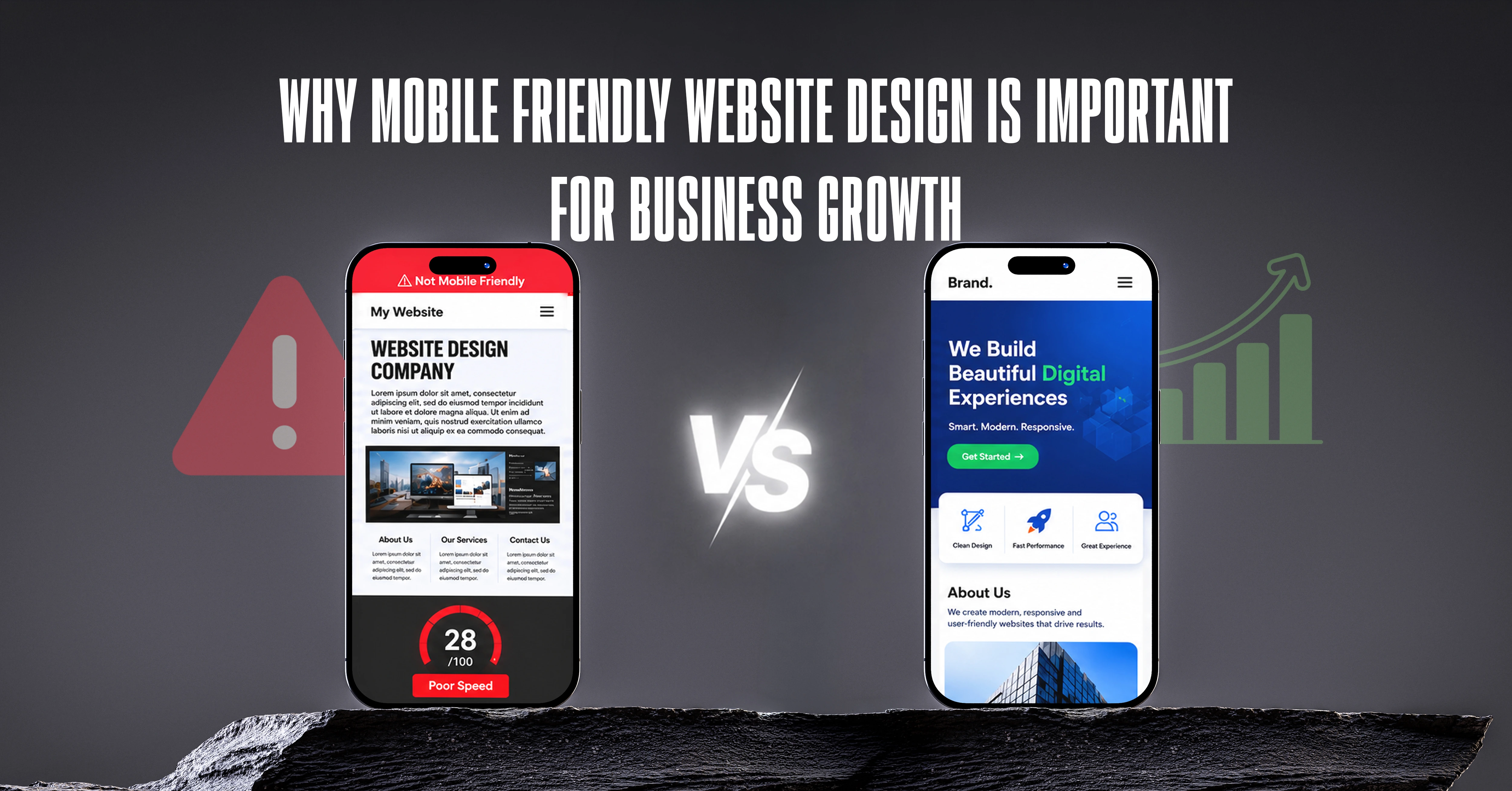
Contrarian Observation: Mobile-Friendly Does Not Mean Mobile-Optimized
Responsive Design Is Not the Same Thing
Many businesses proudly claim their website is mobile-friendly. What they usually mean is that the website fits on a phone screen. That is only the beginning.
Compatibility Does Not Guarantee Usability
A website can technically work on mobile while still creating frustration. Visitors care about ease. Not compatibility.
Related: Learn more about website performance issues that silently reduce trust and conversions — often starting with desktop-first thinking in a mobile-first market.
What High-Performing Mobile Websites Do Differently
They Prioritize Speed
Every second matters. Fast websites reduce friction.
They Simplify Navigation
Visitors should never feel lost. Clear navigation supports confidence.
They Reduce Effort
The fewer obstacles between interest and enquiry, the better the results.
They Focus on Business Outcomes
The best websites are not designed around features. They are designed around conversions. Businesses that want their website to actively generate enquiries should explore structured SEO services in Chennai alongside mobile performance improvements — both work together to improve visibility and conversion.
Final Thoughts: Mobile Is No Longer the Future. It Is the Present.
A website does not compete only against competitors. It competes against every excellent digital experience a customer has already had. Customers compare your website to Amazon, Airbnb, Uber, and the best websites they use every day.
Those experiences shape expectations. And when a website falls short of them, visitors do not complain — they simply leave. Most businesses never trace that back to the real cause.
Businesses that embrace mobile-first thinking create stronger customer experiences. Stronger experiences create stronger trust. Stronger trust creates better enquiries. Better enquiries create business growth.
Ready to Build a Website Designed for Modern Customers?
The best websites are not the ones that win compliments. They are the ones that win customers. Every business invests time, effort and money attracting attention through SEO, advertising, referrals and social media. The opportunity already exists. The question is what happens after visitors arrive.
Do they experience a website that feels fast, intuitive and trustworthy? Or do they encounter enough friction to leave before taking action? At BRAND 360s, we help businesses build websites designed around performance, trust, user experience and conversion. Because the goal is not simply to create a mobile-friendly website. The goal is to create a better business.
